
F25 MEN’S COLOR STORY - Valley of harmony
For Fall 2025 I developed two large color stories per gender. These stories were then broken down further into two capsules each. This was a change from the approximately 4 color stories we had per season prior. This was in an effort to keep our large palettes intact while arranging it into story palettes that had more overlap and intentional cross merchandising.
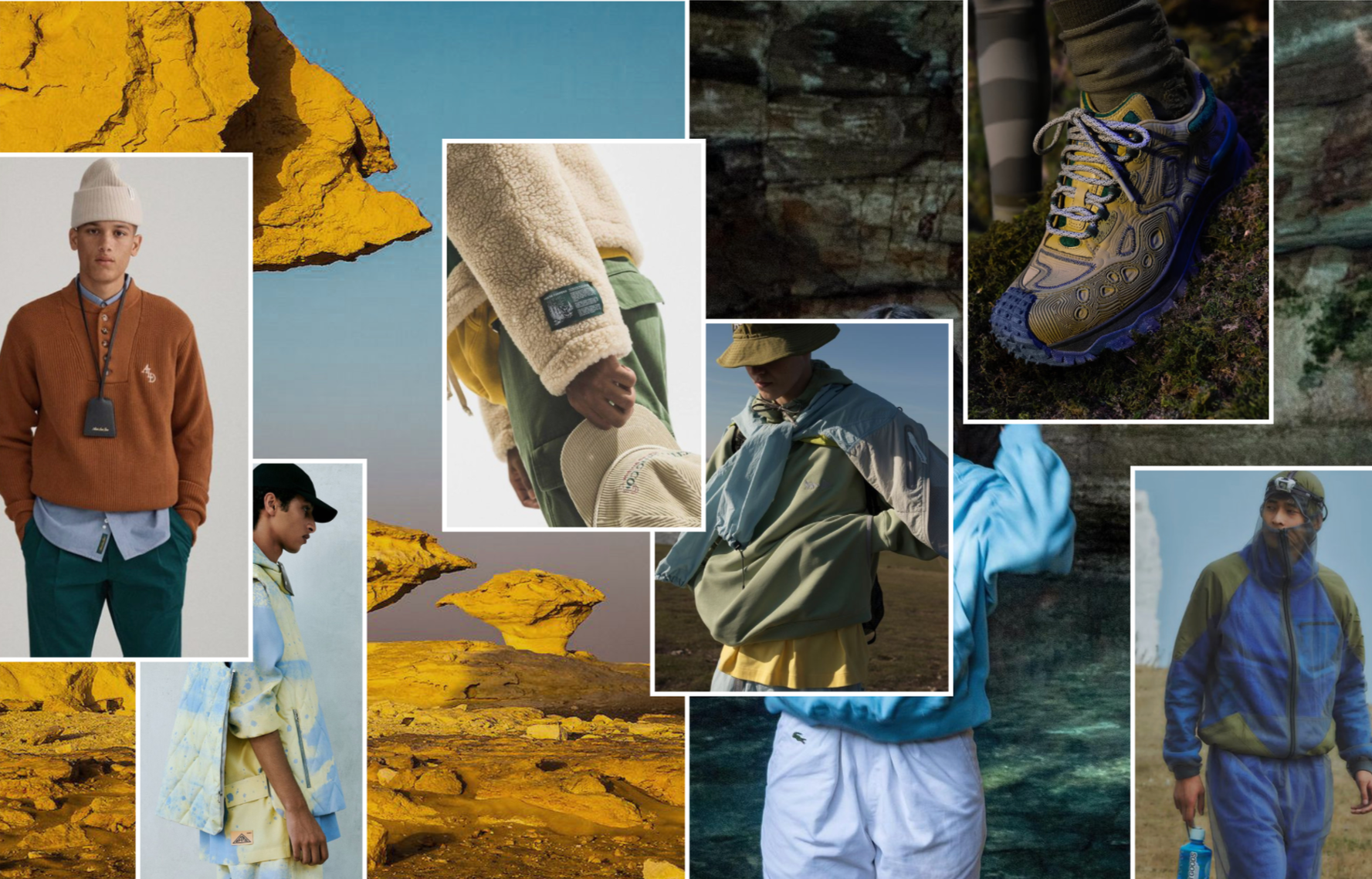
The Valley of Harmony story explores the duality of life and the interplay of color found in the valley between dawn and dusk. Crisp light blues and dynamic yellows capture the hopeful energy of early morning light. Earthy browns and tinted greys, drawn from the rocks, soil, and wildlife of the valley floor, act as the grounding elements that connect both ends of this story. As the day transitions into dusk, the palette deepens into rich, saturated blues and the hero green of Terrain, reflecting the depth of the approaching night.
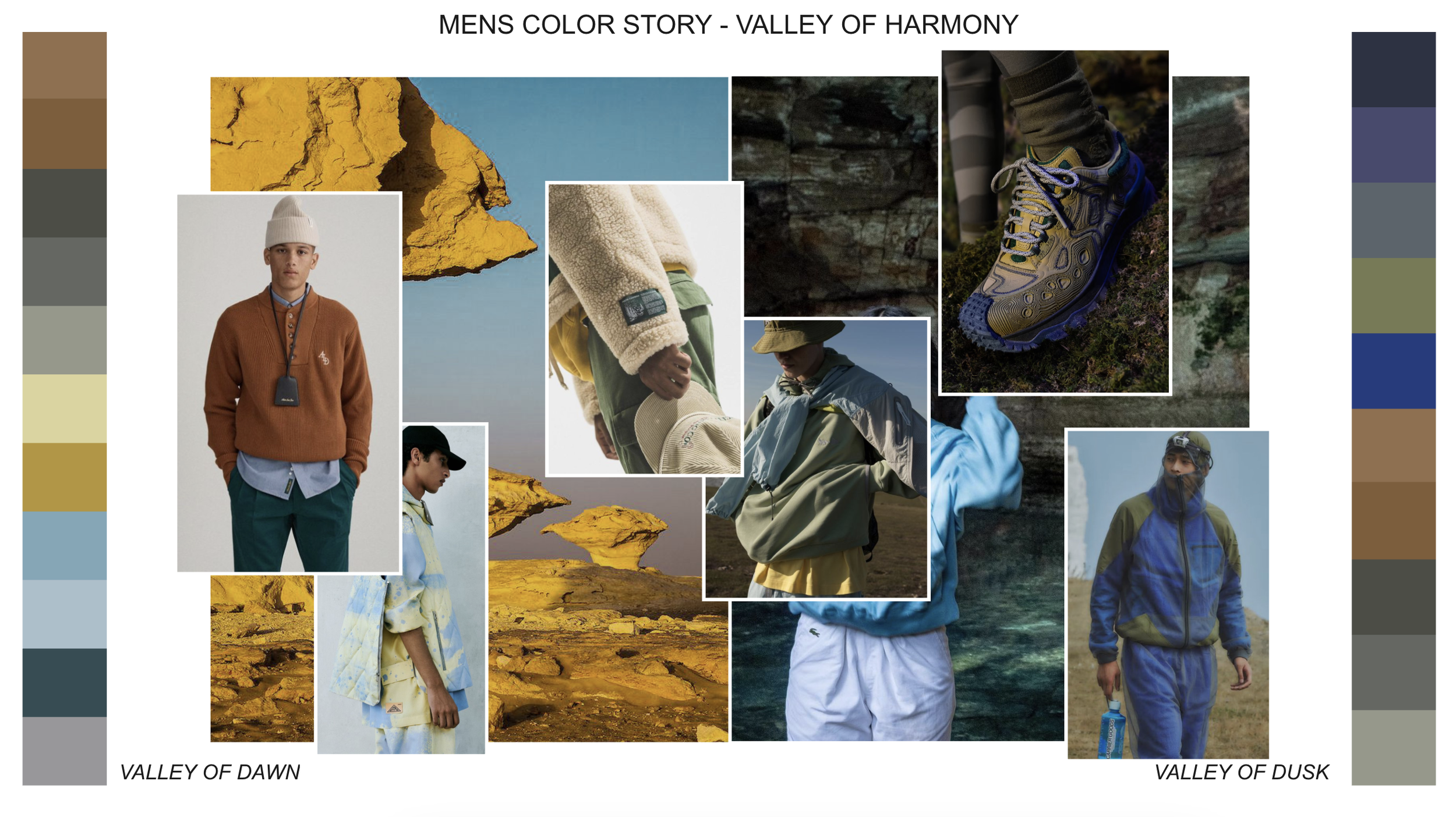
Mens Valley of Harmony moodboard.
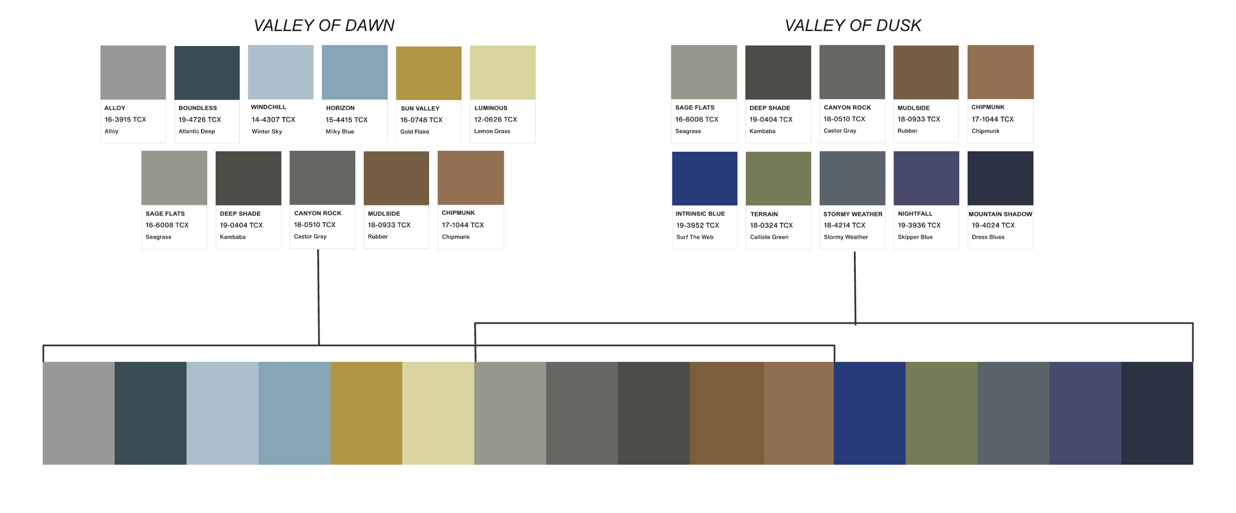
The final break out of the two capsules for this story, including the Pantones, and highlighting the overlap of color that helps these two capsules connect together for cross merchandising.
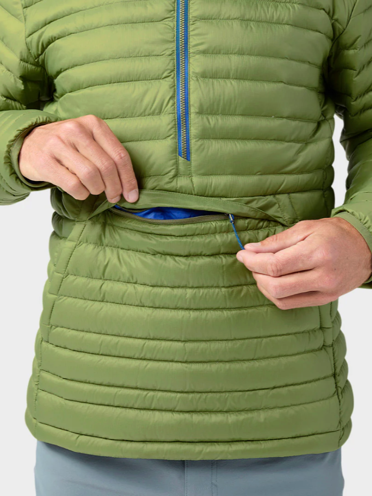
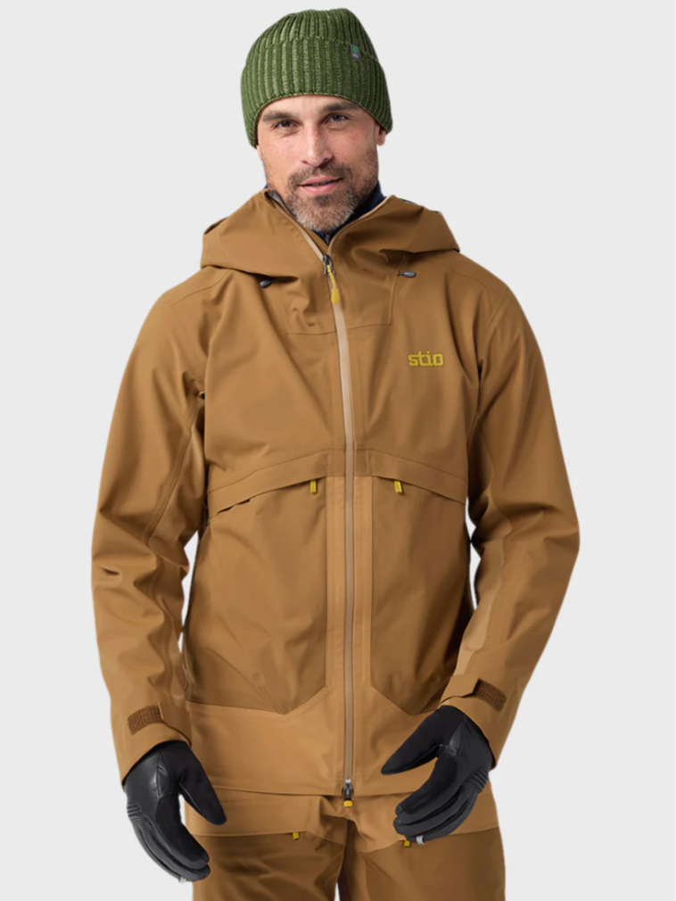
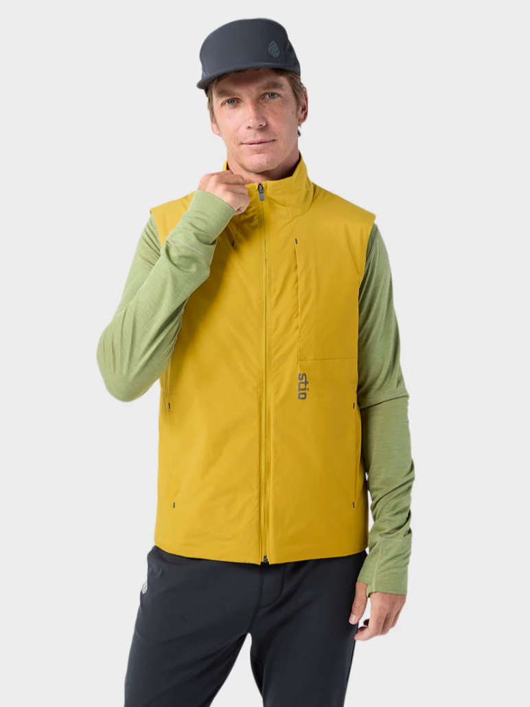
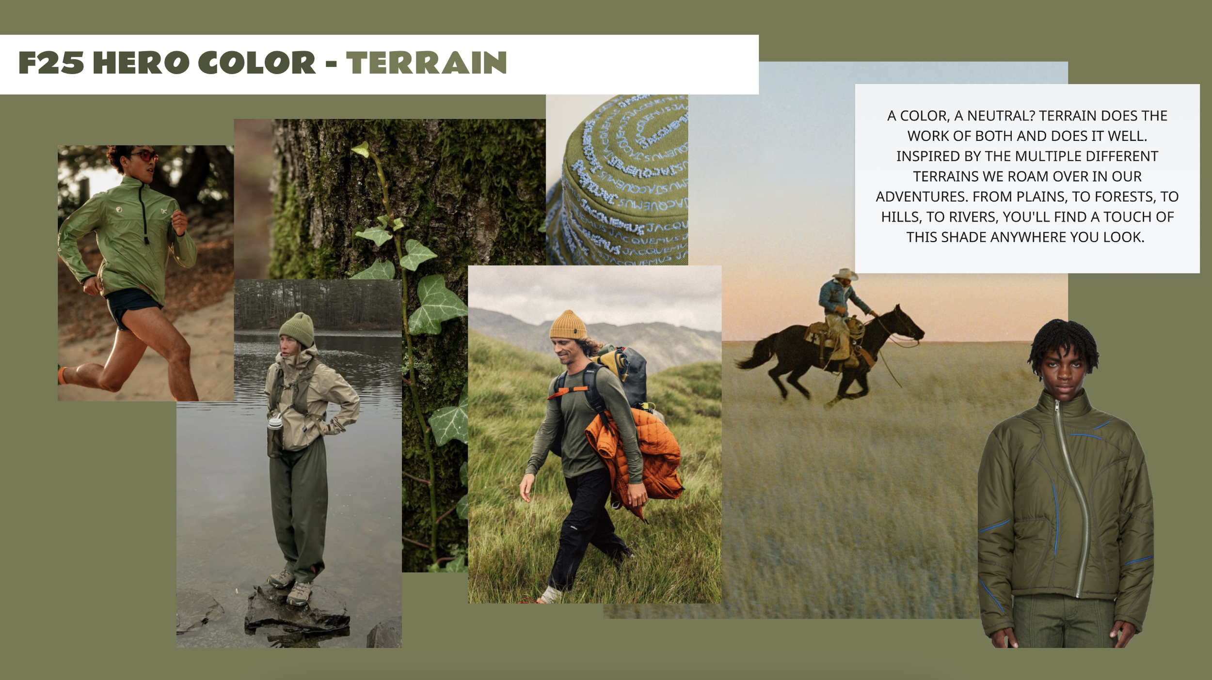
Each season I identify hero colors for the brand. There are usually 4 colors per season and are they most important colors of the season whether by usage amount our trend impact. Terrain, part of the Valley of Harmony story, is the hero green for F25 for the brand and is especially important in mens having usage across ski, insulation, wovens, fleece, and accessories.


